Ben Schmidt made this wonderful visualization of shipping from 1750-1850 using ship log data. (H/T Metafilter). It’s long, but worth watching. You can see the infamous Triangle Trade, the effect of the American Revolutionary War, the rise of British colonial sea power, and more. This is a must-see for any fan of Patrick O’Brian’s Master & Commander books (“OMG! This is probably where Maturin’s sloth was debauched!”)
You can also see all 100 years of data divided by season.
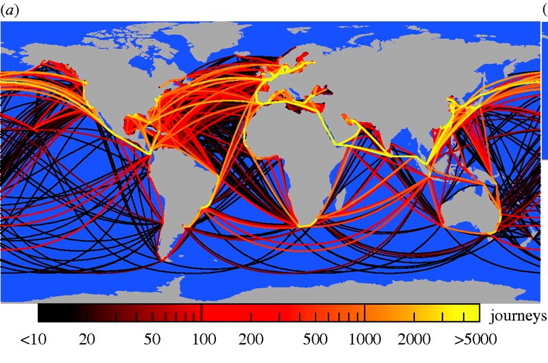
Contrast that with this map of cargo ships (bigger than 10,000 gross tonnage) during ONLY 2007. (from Kaluza et al. 2010).


Are you shipping me?
http://www.youtube.com/watch?v=pJX0ZF1_QjA
I like the subtle touch the creator added by making the month label follow the ITCZ.
incredible and mesmerizing!
The ShipMax link made me guffaw
And thank you for the ITCZ tip–it went over my head, I need the subtitles!
Imagine the oceanographic data you could get with a low res ADCP and surface water-quality monitors on every one of those ship.
Or something like the NC FerryMon system – http://www.unc.edu/ims/paerllab/research/ferrymon/images/index.html
There was an enormous cotton trade US >>> UK in the 1850’s, not shown.