News of an rogue iron-dumping experiment off British Columbia, Canada, broke in the Guardian on Monday, and was followed up by the New York Times, the New Yorker, and io9. Dr. M explained why this was appalling news, and ever since we’ve been having a vigorous discussion in the secret Deep Sea News lair on exactly how to visualize this bloom. None of us are satellite experts, and the satellite image included with the Guardian (which was reproduced all over) was extremely hard to interpret. It was hard to tell if there was a bloom or just natural swirls and eddies.

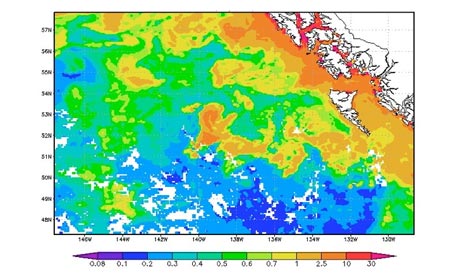
Fortunately, Jim Acker of NASA Earth Observatory Goddard Earth Science Data and Information Services Center [apologies! -MG] was on the case. His analysis of satellite data, using the Giovanni information system, is so interesting that I am coming out of my dissertation-writing hole specifically to highlight it. First, to prove that there’s a iron-related phytoplankton (microscopic ocean plant) bloom, you have to show that there wasn’t a bloom there to start with. This satellite image, taken July 19-26 2012, shows the chlorophyll-a concentrations in the surface ocean – warm colors mean more chlorophyll, which means more phytoplankton, and cool colors mean less. You’ll see in the image below that there’s more phytoplankton near the coast, which is normal for this area of the world, but that offshore there is far less. (The white means no data, since there were clouds in the way of the satellite’s sensors.)
The iron was purportedly dumped in the beginning of August, but clouds mostly blocked the satellites around that time. The next good image was taken between August 20-27, and clearly show a bloom (large orange blotch) offshore .
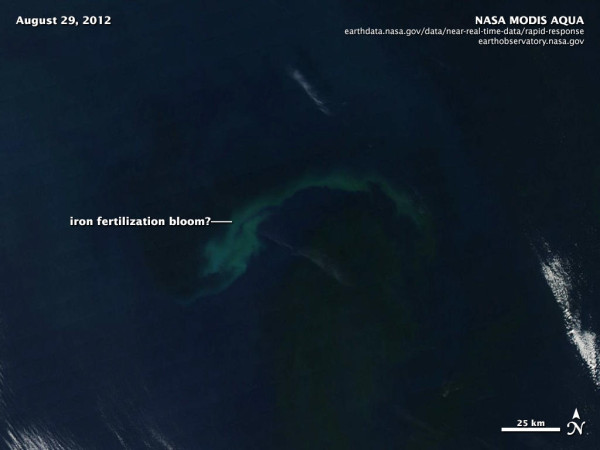
On August 29, the clouds almost entirely disappeared, allowing a really clear view of the area. This is a pseudo-true color image from the MODIS satellite, courtesy of Rob Simmon – if you were looking down from space, this is what you might have seen. The light-colored swirl is likely a coccolithophore bloom – a type of phytoplankton with a calcium carbonate shell. If you look carefully, you’re see blackish water both above and below the light swirl – that dark color means that there’s some other kind of phytoplankton bloom (not coccolithophores) there too. The water is dark because all the phytoplankton is sucking up light.
By September 5-12, the iron fertilization bloom was mostly gone. The area where it used to be is no longer a big orange blotch, but mostly green and yellow, with a few areas of orange.
I’ve highlighted just a few of the wonderful and informative Giovanni visualizations – there’s a lot more over at their website. I encourage you to check them out. But in short, did Russ George’s iron dumping actually cause a plankton bloom? It does seem that it did.
UPDATE 19 Oct 2012 10:20 AM PDT: Jim also looked at the chlorophyll anomaly over 10 years of MODIS Aqua data with Giovanni. The area of the purported iron fertilization is 2-5 mg per m3 higher.
Share the post "Satellite imagery of the rogue Canadian iron dumping experiment"


Nice explanation and examples of using satellite data. Last night, I was talking to Jim Gower at a meeting we’re having about new satellites, about this bloom and giovanni. A few thoughts to increase accuracy/certainty about if the satellite is seeing a bloom. I’d compare a few different chlorophyll products and maybe consider having a look at the fluorescence line height (Giovanni might have this) and also look at how often blooms occur in the region, I’m no expert on the area but maybe a seasonality metric of some kind might tell us if this is all bloom from the iron or just natural/an exacerbation.
I also wonder if maybe another colour scheme may help too – that orange is 2.5-10 which could be a large difference in typical blooms for this region and in the surrounds of this image?
Thanks again for the article!
Hayley
Good points, Hayley. Jim did look at normalized Fluorescence Line Height (nFLH), and it shows the bloom quite nicely. I didn’t use it only because I was too intimidated to try to explain nFLH for a general audience before bed last night.
Also, I definitely agre that it would be interesting to compare many different years – even if this was iron-induced, it may not be abnormal for the area. I don’t have any idea, but it certainly is a highly productive region of the ocean.
Also, check out the update in the post – Jim looked at the chlorophyll anomaly over 10 years of MODIS Aqua data.
Thanks for the great article, Miriam! It will also be possible to look at the anomalies for other data, like nFLH, when time permits. And I would add that anomalies as high as seen are pretty unusual for the open, normally-oligotrophic, ocean.
The icon that was chosen for me looks like an alien dinoflagellate.
Awesome! Great anomaly plot :)
Got a question re scale. Mining companies dump 180 million tons of tailings into waterways each year. (The ridiculously-unwieldy link to the PDF with a fairly robust-looking biblio here: http://www.google.com/url?sa=t&rct=j&q=&esrc=s&source=web&cd=2&cad=rja&ved=0CCYQFjAB&url=http%3A%2F%2Fwww.earthworksaction.org%2Ffiles%2Fpublications%2FTroubled-Waters_FINAL.pdf&ei=95WBULGKLum10AHz2ICgDg&usg=AFQjCNGsARwSbiVSAYtm6wp_nsdONerPhw) Is 100 tons of iron sulfate significant in that light? Negligible? Nobody-knows-which-is-part-of-the-problem?
Harry: the iron is significant if it’s added to an area of the ocean that’s iron limited. Runoff from mine tailings is going to stay close to shore, where there’s usually plenty of nutrients (and plenty of life) already.
Thx much. It reminds me of the recent study showing that huge blasts of whale poop may be part of the driver for phytoplankton blooms in the NW Atlantic. The fragility and interconnectedness of the ocean’s jigsaw puzzle pieces is what gets me.
Oh, to have had MERIS or SeaWiFS up there. This is where new generations of hi res hyperspectral sensors like HICO and PRISM will help, especially since airborne sensors like PRISM can be flown on demand, if we only know about it in near real time.
A few questions come to mind. Would mollusks show any calcium increase in the areas affected? (A growth ring in example.)
Could soil samples reveal anything?
My thought is that now that it’s been done, a study of it’s effects would be in order.
It’s a poor way to do environmental research as further stressing the oceans that are stressed already may do harm.
I don’t think that this bloom could have been triggered by the iron release. I went through a rough calculation of the iron that would be required to start a 10,000 km bloom.
I assumed an average concentration of Chla of 7ug/L. A bit higher than what you have above. We are a remote sensing lab and we are seeing higher Chl. I assumed a surface mixed layer of 20m. This may be shallow but minimizes the iron needed.
This gives a Chla load for the bloom of 1.4 E12 mg.
Assuming a Chl:C ratio of 30 and a Fe:C ratio of 10 e-3:1 (these are both on the low side of literature values but minimizes the iron needed).
There needs to be an addition of 7700 metric tones of FeSO4. That’s assuming 100% sloubility. Because the salt was added as a dry crystal it is doubtful that 100% was dissolved. Russ George claims he added 120 metric tons. It seems to me that there is very little chance that he casued the bloom.
Allen J. Milligan, Ph.D.
Associate Professor, Senior Research
Department of Botany and Plant Pathology
2082 Cordley Hall
Oregon State University
Corvallis, OR 97331-2902
Email: [email protected]
Office: (541) 737-5276
Lab: (541) 737-6204
Cell: (541) 908-0569
Fax: (541) 737-3573
http://web.science.oregonstate.edu/ecophysiology/
Look what’s happening on the EAST COAST of USA!!! An ICE AGE!!! that’s what happens when you put 100,000 of Iron on the West Coast!
Is this area the Bowie Seamount? I ask, because nobody is coming out and saying this. If so, this would be quite a different scenario than dumping iron in the middle of deep ocean. Hydrothermal vents in shallow water would change the reaction. My calculation is that hot, shallow water would speed up any phytoplankton growth considerably.
What will the impact be on the adjacent seamounts?
And how about that 7.7 earthquake along the Queen Charlotte Fault?
It appears that the Haida are managing the Bowie Seamount in conjunction with the Canadian government. The terms of this management are not clear:
http://www.wwf.ca/conservation/oceans/bowie_seamount.cfm
There are many other seamounts out there, but not all are managed by the Haida:
https://www.deepseanews.com/2009/08/northeast-pacific-seamount-map-the-gift-that-keeps-giving/
Iron dumping is not mentioned here:
http://www.pac.dfo-mpo.gc.ca/oceans/protection/mpa-zpm/bowie/mou/mou-prot-eng.htm
Any chance Disaster Monitoring Constellation Imaging International is providing images of this phytoplankton bloom?
The Kodiak-Bowie seamount chain is the boundary between the North American, Pacific and Juan de Fuca plates. What are the implications of dumping iron on or near the Bowie hotspot, an area with a known magnetic anomaly? Pole reversal?