Eric Heupel is a graduate student at University of Connecticut in Oceanography. He keeps a personal blog at Eclectic Echoes and Larval Images, and used to part of The Other 95% team along with me before we closed shop. You can find Eric tweeting as @eclecticechoes.
——————————–
Recently the deaths of bottlenose dolphins in the Gulf of Mexico has been getting tossed about a little carelessly, as Para_sight pointed out.
Go ahead and read it… I’ll wait. (It really is important, but please, do come back!)
Welcome back!
While the deaths are disturbing, and could be linked to the Deepwater Horizon oil spill last year, as Para_sight put it:
It’s important to critically evaluate these sorts of reports, however, and not to allow traditional press/media to create causal relationships for us, based on an editor’s impression of a perceived correlation.
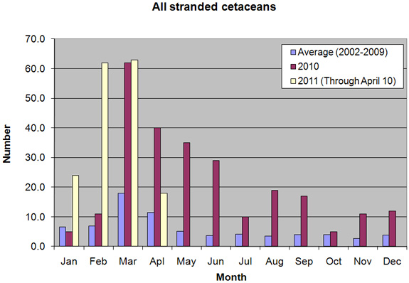
If you recall, the graph provided by NOAA was a little bit lacking, as all the data from 2002 to 2009 was averaged together by month:

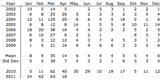
As Para_sight pointed out, the averaging of the 2002-2009 data makes it hard to tell exactly what is going on. Using the raw files available at the NOAA site and the barest amount of statistics I decided to take a quick look at the data. In Excel I subtotaled the strandings for each month for 2002 through 2009 and used the 2010 and 2011 tables on the NOAA website to create a simple table with all the strandings:

Since the NOAA data was presented as a bar graph of the average monthly values, they removed two large historic unusual mortality events (UME) (March 2004 and September 2005 – April 2006) from their calculation of the 2002-2009 averages to prevent skewing the results towards those known UME. Since it follows logically from the NOAA definition that outliers should be an UME, I thought it would be instructive to include the outliers in the plots and compare the current event with prior UMEs. Using box and whisker plots means that I can include outliers without them skewing the data. Finally I laid the 2010 and 2011 data over the boxplots as point data.
For those unfamiliar with a box and whisker plot, it’s an informationally rich plot. It visually communicates far more information that a bar chart generally can. For a simple illustration suppose you teach a class with 11 students and recent exam scores were 63,76,78,84,86,87,87,88,90,93,102 (bonus points). The average score then is 85, but this doesn’t say much about the distribution of scores. We can get that information through a box and whisker plot.
First we need to find the median or 50th percentile, the value in the middle of the ordered list of scores – here 87 (the first 87). Call it Q2. Of the remaining scores half are higher (or equal) and half are lower (or equal) than the median value. For the lower half of the scores (63,76,78,84,86,87) find the median. Here the median would be the average of 78 and 84 – 81. This is then the 25th percentile point, a quarter of the grades are lower than this score, the rest higher. For that reason it’s referred to as Q1 (the first quartile). The median of the higher half of the scores (87,87,88,90,93,102) is 89 which is the 75th percentile, three quarters of the scores are lower than this one so it referred to as Q3. The range from Q1 to Q3 represents the middle 50% of all the scores and is referred to as the Inter- Quartile Range or IQR. In our test case the IQR is 89-81=8. If this range is small then the central scores are tightly grouped, though they can still be skewed higher than the median or lower than the median. Multiplying IQR by 1.5 is also used to determine the whiskers. IQRx1.5 = 12 added to Q3 is the maximum the whisker will extend above the box (here 101), and 12 subtracted from Q1 is the minimum value the whisker will extend to below the box (here 69). The whiskers may appear shorter in a boxplot though as they are only drawn to the data point closest to the maximum and minimum without exceeding them – here that would be 93 and 76 respectively. Any data points outside the whisker points are considered outliers often plotted as open circles.

Interpreting this very simple example we can see the median at 87 (bold line across the box). The box (81-89) indicates the central 50% of the scores are B’s with as many B+’s as B’s and B-‘s. We also see that all but one of the lowest scores are from 76-80, and all but one of the highest quarter of the scores are between 90 and 93. There are also two outliers, one high (102) and one low (63). Most professors I have had would be pretty pleased with these scores as they tend to indicate an exam that is appropriately hard, but not too hard and students that are generally “getting it”. The real power of box and whisker plots though comes in communicating and comparing more complicated data sets.

Looking at this graph the things I quickly noticed:
- March is historically the worst month for strandings and it is in March that the worst single month of strandings occurred (>120 strandings)
- March of 2004 was far worse that the 2010 and 2011 March data
- 2010 and 2011 data for March are both well outside the normal historical distribution (considering the 2002 to 2009 period to be “historical”)
- 2010 data showed outliers for every month from March to December, except October. Oil spill? Remember the spill occurred on April 20th. What about October?
- All three months in 2011 have been outliers well outside the normal historical range
- April, with only 10 days of data in, is shaping up to be outside the normal range as well.
- NOAA probably should provide analysis with this type of detail online for this hot button issue.
So it comes down to the definition of an UME again. The NOAA definition is, as Para_sight pointed out, in plain English, but not very solid. You’d have better luck nailing jello to the ceiling. Based on the data though, I would definitely call 2011 a UME event, and would call April through December of 2010 the same. Not only for the fact that each month is an outlier (save October), but also for the consecutive pattern of the outliers. The nature of random data is that there will be some random events that are above and below the expected value range, so one month slightly above the historic trend would be hard to call an event, but any one event well above the normal range or several consecutive months all as outliers above the historic range would be an event. So the boxplot, by showing far more information about the distribution of the data and identifying outliers helps clear up the situation, but it would still be preferable to have clearer scientific guides to define a UME.
As for the oil spill being the cause (whether proximate or ultimate), the pattern of the event does strongly suggest that the oil spill is related, but looking at the prior events, it is not outside the realm of possibility that this is not directly related to the oil spill. The best evidence to determine the involvement (or lack thereof) of the oil spill is going to be found in necropsy and toxicology reports of the stranded animals.
Share the post "DSN Scientist in Residence Eric Heupel Revisits Gulf of Mexico Dolphin Mortality Event"


