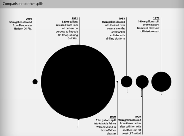
UPDATE June 9: The black circles are misleading, due to an error in their math. See an accurate comparison from David Bradley at Sciencebase.
The folks over at Iglu Cruise lines compiled an up to date infographic on the Gulf of Mexico oil leak spill disaster ecological catastrophe. Head over there for the full monty. Below is a snippet that puts Oilmageddon 2010 in context.


Interesting graphic, but the larger part is deeply flawed. Iglu Cruise appear to be using the most conservative flow estimates throughout, which puts the relative sizes of the circles in doubt, and have a side chart showing various flow estimates as a time-series graph which is a strange choice for showing conflicting data. Also, if BP estimates 60000bpd on May 5 (spill flow graph), how is capturing 10000bpd on June 6 capturing “more than half” (timeline)?
Iglu Cruise also purport to show “how BP managed to cap the potential world crisis” which seems a bit premature at the time of this writing. ;)
Still, that Iraqi fuel dump is just, ugh, a terrible crime.
Really, and it was never talked about before, why?
I didn’t think this sounds right. Why no talk on these in the past.
The graphic is wrong, check here why:
http://blogs.discovermagazine.com/cosmicvariance/2010/06/08/pie-are-square-oil-spills-are-round/
Kevin, I’ve re-done their graphic based on area to show approximate relative scale of the oilspills (red blobs within oily black circles). It’s not nearly so shocking as the original but mathematically a more accurate visualisation.
http://bit.ly/bFp1eu
Thanks Mike, nice reads.
^thank you David.
I think it was more shocking because the 2010 spill is saddly approaching the rest of the spills. :S
Thanks! I’ve added a link to your graphic at the top of the post as well.
I am gonna crack slap up to smithereens,always some more,and more shoulda coulda woulda.What a circus,trampled by the elephants everytime.You have to learn to watch your kids,or except it when they get splattered.Blaa Blaa Blaa.