Check out @NWSSeattle image of windstorm! We’re monitoring the situation and will have highway updates here. pic.twitter.com/WEvmMInlKs — WSDOT Traffic (@wsdot_traffic) March 13, 2016 We…
View More Waves of Washington’s Windstorm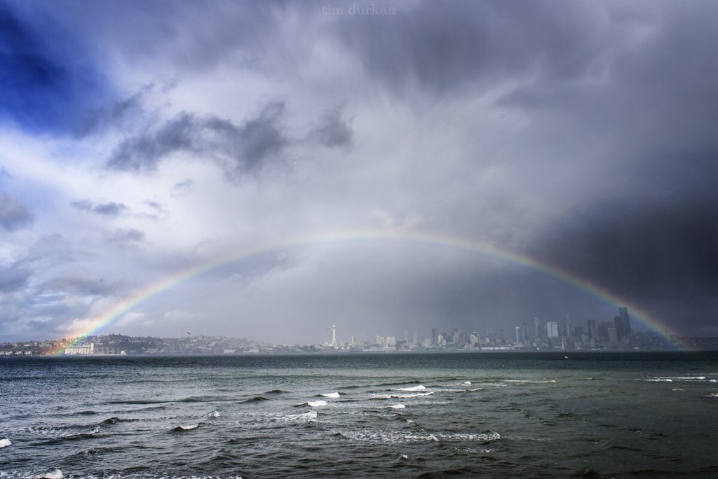

Check out @NWSSeattle image of windstorm! We’re monitoring the situation and will have highway updates here. pic.twitter.com/WEvmMInlKs — WSDOT Traffic (@wsdot_traffic) March 13, 2016 We…
View More Waves of Washington’s WindstormWhen I posted Iglu’s revised Oil Spill Timeline a few days, I didn’t give much thought to visual properties of the data presented in the…
View More Putting Oilmageddon 2010 in Context